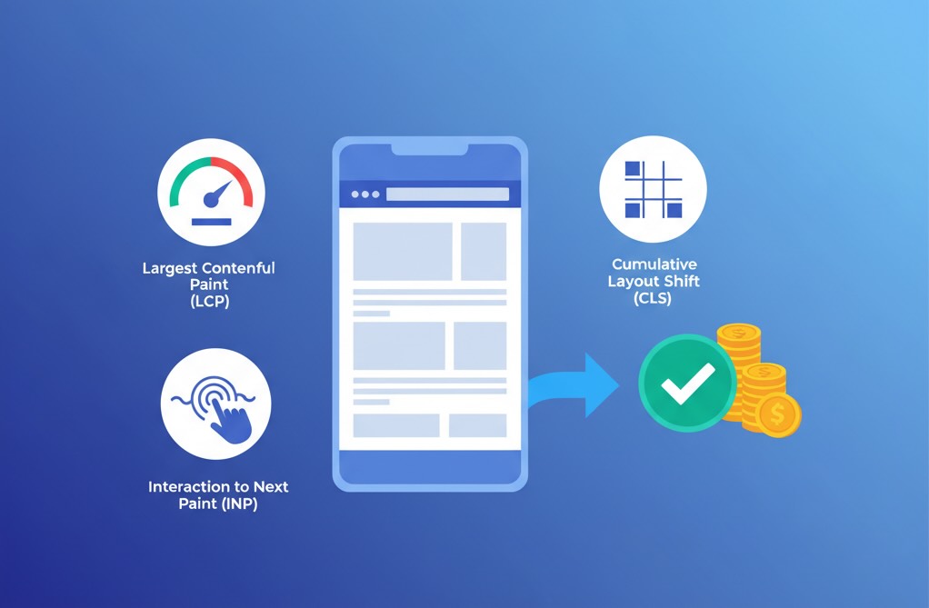
You don’t invest in performance because it’s elegant—you do it because it moves revenue. Core Web Vitals (CWV) give teams a common language to connect speed and stability to business outcomes. Below is a practical, data-driven look at how LCP (Largest Contentful Paint), INP (Interaction to Next Paint), and CLS (Cumulative Layout Shift) correlate with conversion rates—and how to prove ROI without getting into implementation.
TL;DR for executives
- Faster, steadier pages convert more, especially on mobile and first-time visits.
- Improvements are non-linear: crossing CWV “good” thresholds (e.g., LCP ≤ 2.5s, INP ≤ 200ms, CLS ≤ 0.1) often yields step-changes, not just smooth gradients.
- The biggest gains tend to come from long-tail fixes (slowest percentiles), not just median wins.
How CWV maps to money
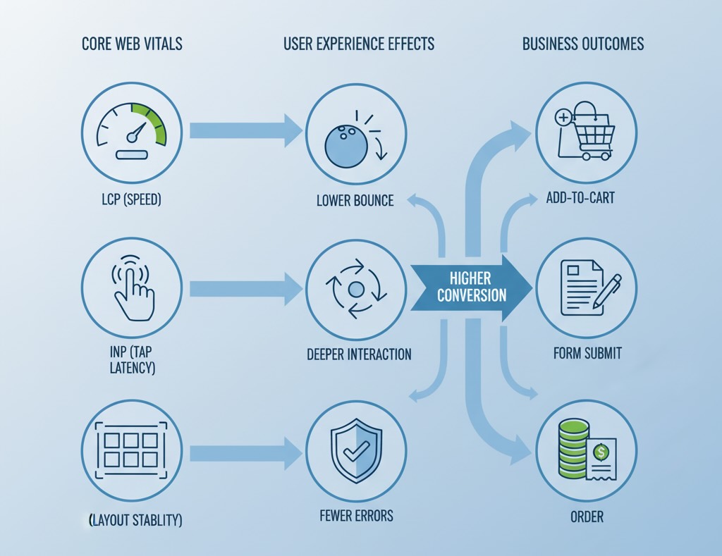
LCP (speed to meaningful paint)
- Business effect: Raises first-page comprehension, cuts early bounces, boosts add-to-cart and form starts.
- Where it matters most: Mobile, non-brand traffic, image-heavy PDPs, geo/segments with weaker networks.
INP (end-to-end interaction latency)
- Business effect: Smooths key actions (filtering, variant selection, “Add to cart”, “Next” in checkout).
- Where it matters most: Product discovery flows and multi-step forms (e-commerce checkout, trial sign-up).
CLS (visual stability)
- Business effect: Protects confidence while interacting (no shifting buttons or prices), reducing rage clicks and form errors.
- Where it matters most: Pages with ads, dynamic recommendations, late-loading headers/consent UI.
Cohort designs that reliably show impact
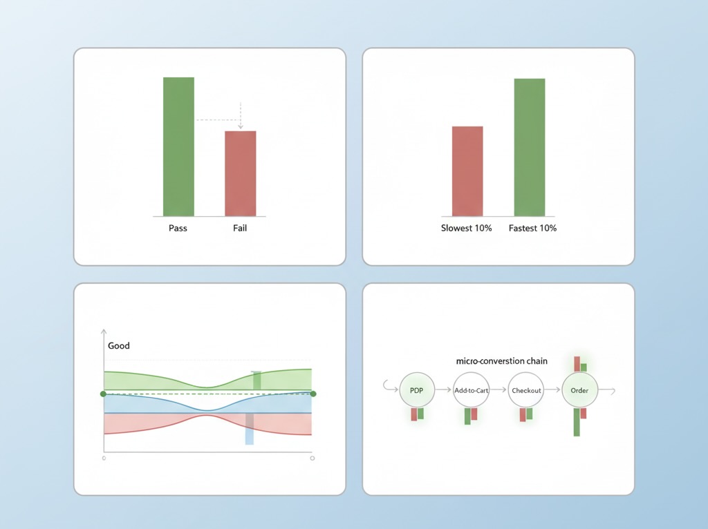
To prove causality without implementation details, frame your analysis like this:
- Pass/Fail CWV cohorts
Group sessions by page-level CWV outcome (e.g., LCP “good” vs. “needs improvement/poor”). Compare conversion, AOV, and funnel completion. Control for device, traffic source, and landing page type. - Percentile slicing
Look beyond averages. Compare bottom 10% (slowest) vs. top 10% (fastest) sessions on the same template and source mix. The delta here often explains most of the upside. - Threshold proximity
Create bands around thresholds (e.g., LCP 2.3–2.5s vs. 2.6–2.8s). If conversion jumps when you cross into “good,” you’ve got an executive-ready story. - Micro-conversion chains
Track intermediate steps—PDP view → add-to-cart → checkout start → order. CWV improvements frequently lift earlier steps first; final orders follow with lag.
Real-world style snapshots
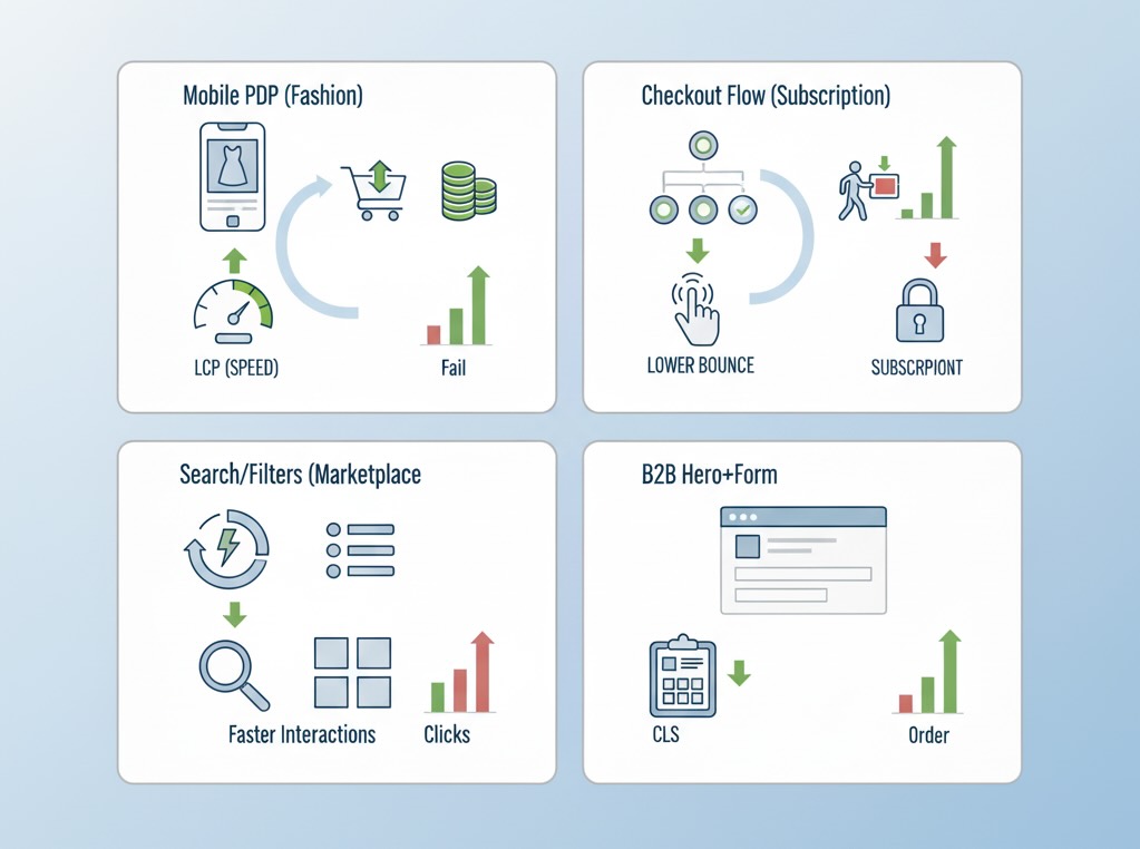
Numbers below are typical ranges we see across public case studies and aggregated industry analyses; your mileage will vary by vertical, device mix, and UX complexity.
1) Fashion e-commerce, mobile PDPs
- Change observed: Median LCP from ~3.1s → ~2.2s; 95th percentile from 7s → 4.5s.
- Outcome: +8–15% add-to-cart rate, +5–10% orders. Largest lift in non-brand paid social traffic.
2) DTC subscription, checkout flow
- Change observed: INP from ~380ms → ~180ms on coupon, shipping, and payment steps.
- Outcome: –12–20% checkout abandonment, +3–7% overall conversion; fewer support tickets about “frozen” buttons.
3) Marketplace search & filters
- Change observed: INP −200ms on filter chips and sort controls; minor CLS cleanup on results tiles.
- Outcome: +6–12% filter usage, +4–9% click-through to listing pages, improving downstream bookings.
4) B2B SaaS lead gen, hero + form
- Change observed: CLS from ~0.18 → ~0.06 by stabilizing hero and form elements.
- Outcome: +5–9% form completion, notably among new visitors from comparison sites.
Key pattern: Tail risk drives the story. Trimming the slowest 10–20% of sessions often yields more revenue than shaving 100–200ms off the median.
Non-linear effects and where they show up
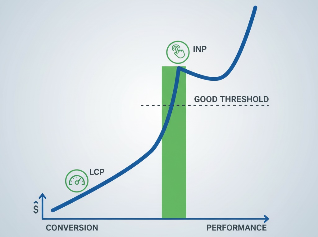
- Threshold cliffs: Getting just below LCP 2.5s or INP 200ms tends to unlock a step-change in engagement. Hover above the line and gains are muted; cross it and funnel friction drops visibly.
- Compounding wins: LCP gains reduce bounce; INP gains increase interaction depth; CLS gains protect intent. Together they combine multiplicatively through the funnel.
- Diminishing returns: After passing “good,” returns continue but flatten. That’s when prioritization should shift from speed at all costs to UX clarity and offer relevance.
Measuring ROI without implementation talk
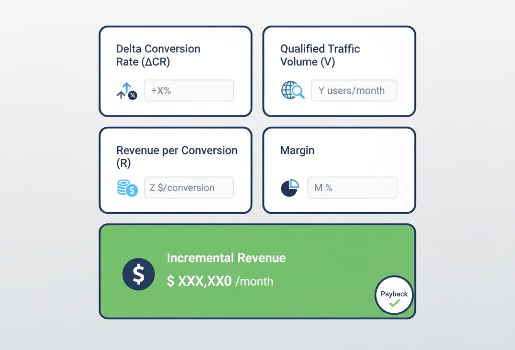
You only need four inputs to model performance ROI for leadership:
- Incremental conversion lift (ΔCR) from your CWV-based cohorts (e.g., +0.6 pp absolute).
- Qualified traffic volume (V) to affected templates/segments.
- Monetization per conversion (R)—AOV or LTV for lead-gen.
- Attribution window alignment—ensure the lift aligns with your revenue capture period.
Back-of-envelope:
Incremental Revenue ≈ V × ΔCR × R (optionally × margin).
Then divide by the period and compare to your performance investment to get payback and ROI. Because CWV gains are durable, payback windows are often measured in weeks, not quarters.
Confounders to neutralize before you declare victory
- Source mix shifts: A surge in brand search can mask or mimic performance gains. Segment by channel.
- Promotions & pricing: Discounts boost CR independent of speed; exclude promo windows or control for them.
- Template drift: Content or UX changes during your measurement window can bias results; keep a change log.
- Analytics integrity: Bot traffic, missing events, or sampling can distort both CWV and conversions; validate with server-side or warehouse checks.
- Device/network reality: Performance matters most where constraints are real. Segment by device class and effective connection type.
What “good” looks like in practice (for analysts)
- Metric-aligned dashboards: Pair CWV percentiles (p50/p75/p95) with funnel stages on the same time axis.
- CWV × business heatmaps: Rows = templates (Home, PLP, PDP, Checkout), columns = CWV state (good/NI/poor), cells = conversion deltas. Executives grasp this in seconds.
- Tail watchlist: Track the slowest 10% LCP and INP daily; alert when they drift. The tail predicts tomorrow’s conversion more than the median does.
- Context cards on reports: Always show device, geography, and traffic mix alongside any conversion lift to prevent “speed fixed everything” narratives.
When results disappoint (and what that means)
If CWV improves but conversion barely moves:
- You were already in the “good” zone; expect smaller, compounding gains rather than headline jumps.
- The wrong pages moved (e.g., blog posts) while high-intent templates (PDP/checkout) didn’t.
- Offer clarity or UX friction dominates the experience; performance isn’t the bottleneck.
- Attribution lag hides the lift—especially for considered purchases. Extend your measurement window.
Each scenario is valuable: you’ve either captured the performance ROI or learned where to point the next lever.
The bottom line
Core Web Vitals aren’t vanity engineering metrics; they are leading indicators of revenue. The clearest wins come from pushing high-impact templates and segments across “good” thresholds—especially on mobile and for new visitors—while taming the long tail of slow sessions. Use pass/fail cohorts, percentile analysis, and threshold-adjacent bands to quantify lift, then tell the story in business terms (ΔCR, incremental revenue, payback).
When performance is treated as a measurable product input—not a technical hobby—CWV improvements earn their place alongside acquisition and merchandising in the growth plan.

